Overview
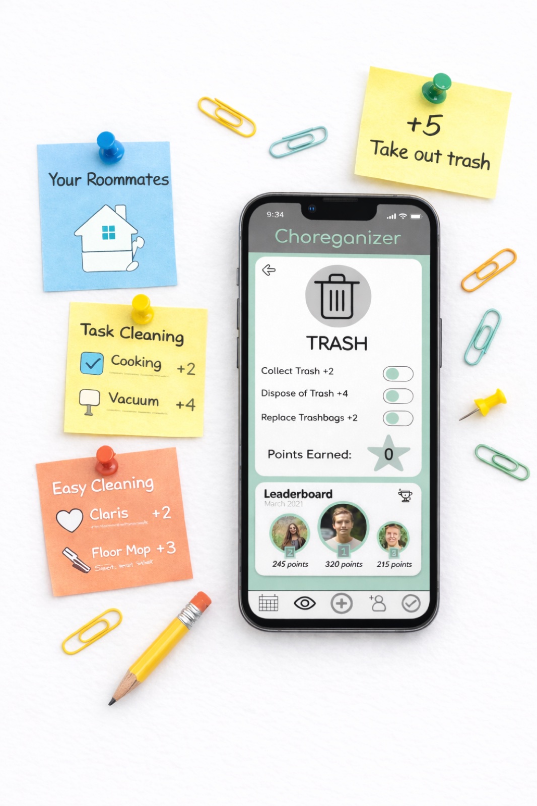
Choreganizer is a gamified household management app I originally designed in college and later redesigned to showcase how everyday chores can be transformed into a fun, fair, and trackable experience, especially in shared living environments.
The app reimagines task management as a points-based system where users upload proof of completed chores, earn rewards, and compete for prizes. By combining accountability with motivation, Choreganizer encourages consistent participation while fostering a cleaner, more collaborative living space.
This redesigned version, created in Figma, balances playful interaction with practical usability, demonstrating how thoughtful UX can turn routine responsibilities into engaging experiences.
Live Prototype
Explore the Figma prototype below, or open it in a new tab for the full experience.
Design Reflection
Revisiting Choreganizer allowed me to critically evaluate how my design thinking has evolved. With a stronger foundation in UX principles, I approached the redesign with a focus on clarity, usability, and collaboration.
I identified opportunities to simplify interactions, improve visual hierarchy, and create a more intuitive navigation system. While some updates were strategic — such as restructuring flows and refining iconography — others focused on elevating the overall polish and accessibility of the product.
This project reflects not only a stronger design solution, but also my growth in creating experiences that are both engaging and user-centered.
Key Improvements
Streamlined Navigation
Redesigned the navigation system to create a clearer hierarchy and reduce friction between key actions. Users can now move seamlessly between tracking chores, uploading proof, and viewing rewards with fewer steps.
Improved Interaction Design
Primary actions were repositioned for better accessibility, and iconography was updated to feel more intuitive and action-driven. These changes make the app easier to use without requiring explanation.
Enhanced Feedback and Affordance
Introduced visual feedback like confirmations and subtle animations when users complete tasks or upload proof. Elevation and shadow were also used to signal interactive elements, improving usability.
Consistency and Accessibility
The interface was standardized across components, including buttons, typography, and spacing. I also improved contrast, tap targets, and readability to align with accessibility best practices.
Optimized User Flows
Core flows — completing chores, uploading proof, and redeeming rewards — were simplified to reduce cognitive load and increase efficiency. Progress indicators were added to motivate continued engagement.
Motivation and Personalization
Incorporated elements like badges, leaderboards, and progress tracking to reinforce engagement. I also explored opportunities for personalization, allowing users to feel more ownership over their experience.
Outcome
This redesign demonstrates my ability to take an existing concept and elevate it through thoughtful UX decisions. By focusing on clarity, motivation, and usability, Choreganizer evolves from a simple idea into a more engaging and scalable product experience.